Matching a supplier colour.
For cabinet makers preparing a kitchen render, use the supplier’s swatch image as the colour reference. Paste it into Asterlyn Space for a cabinet run or another surface, then check the result against the real sample.
The customer has picked a board or a stone from a supplier’s range. You want the render to show that colour, not a guess at it. The quickest way is to take the supplier’s own swatch picture and paste it into the studio. This guide covers how, what gets kept, and why the render still isn’t a substitute for the real sample.
Paste the swatch
Open the supplier’s page for that colour
The page for the exact board, stone or tile you’re quoting, with its swatch picture on it.
Copy their swatch image
Right-click the swatch and choose Copy image.
Paste it into the studio
In the Materials panel, pick the surface, click the paste box (it says Click here, then paste a swatch image from the supplier’s website) and paste. You can also drag the image onto it.
Pick the spot, if it’s patterned
For a plain colour the reading is done. For a patterned stone or timber, click the exact spot on the swatch you want rather than accepting the average.
Pick the rest, then apply once
Set every surface you want to change first, then press Apply my changes. Colours, lights and props go on together for one credit.
The Materials panel has a colour for each run: overheads (upper cabinets), base cabinets, island, tall units, oven tower, the cabinet above the fridge, open shelving and panels. It also covers the benchtop (countertop), splashback (backsplash), floor, walls, kickers (toe kicks) and bulkhead. Each surface has its own paste box.
Patterned stone and timber
A single colour can’t describe a veined slab. Averaged out, a white marble with grey veins becomes a flat pale grey that appears nowhere on the stone. Two things help here.
- The picture goes with the render. When you paste onto a surface in the studio, the picture is kept for that project and sent to the render along with the colour. A patterned stone or tile comes back as a close likeness of the one you pasted, rather than a description of it.
- The dropper picks one spot. Once a swatch is pasted, click anywhere on the image to take the colour from that spot. Use it when you want the base tone of a timber, or the ground colour of a stone, rather than the average of everything in it.
The dropper is on the material picker, on an Appearance refine, and on both text boxes. So you can use the same swatch when you recolour one part of a finished render (see fixing part of a render).
Tiles
A colour alone can’t say “tile”. For a splashback or a floor, choose the tile layout as well: square grid, subway (brick bond), herringbone, chevron or hexagon, with the tile width and height in millimetres. There’s no scale in a picture of a surface, so a 600 × 600 mm floor tile and a 100 × 100 mm mosaic look the same until you give the size.
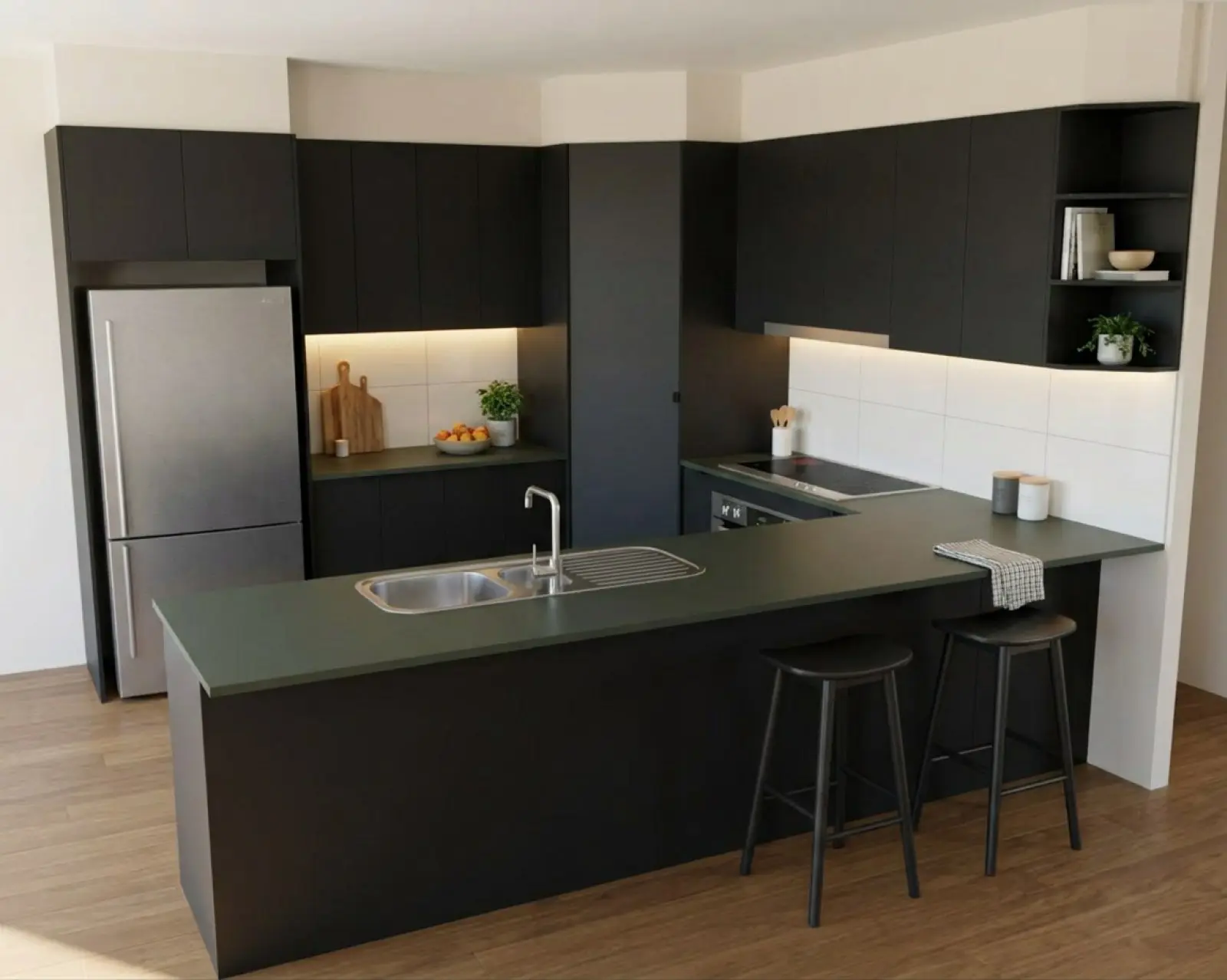
Renders are AI-generated. They closely match the finishes you pick, but they aren't exact. Check real samples before you order.
What’s kept for the project, and what goes in your library
These behave differently, and it’s worth knowing which is which.
- Pasted on a surface in the studio: the picture is used to render that project only. Pasting another replaces it, and clearing it deletes it. Nothing joins your library.
- Everywhere else, the dropper only reads the colour and keeps no picture.
- Your material library lives on the Materials page of your account, sorted into categories, and shows up in the studio’s pickers. Add a new material with its name, brand, category and colour. You can paste a swatch there too: the dropper reads the colour off it, and for a patterned stone it keeps the other colours in it as well as the base. The picture itself isn’t kept.
So for a one-off colour on one job, paste it in the studio. For a board you quote every week, add it to the library once and pick it from there.
Why the screen and the sample differ
Even with the supplier’s own swatch, the render won’t match the sample you hold up to the monitor. A few reasons, all normal:
- Screens vary. The same file looks warmer on one and cooler on another, and brighter on a phone than on a laptop.
- The render puts the colour under room lighting, with the shadows and highlights a room has. A swatch photo is lit flat.
- The supplier’s swatch is itself a photo, with its own lighting and compression.
- Renders are AI-generated. The colour comes back as a close likeness, not a measured match.
If a colour is close but not right, try the dropper on a different spot of the swatch, or paste a cleaner swatch image. Then stop chasing it on screen.
Finish on the real sample
Use the render to sell the look: the mix of colours, the contrast between the island and the runs, how the benchtop sits against the splashback. Confirm the exact shade against a real sample from the supplier before anything is ordered, and have the customer do the same. Their choice should be signed off on the sample in their hand, not on the picture.
Related
Try it on a drawing you already have.
Your first five renders are free. No card needed.